Here's what I've been up to lately.
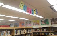
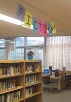
A simple sign made using Comic Sans font, colored paper, and twine. I used MS Publisher and set my paper to landscape format and then made the font as big as I could while still printing two letters a page. I needed the sign to be double-sided since it can be seen from both the book stacks and the circulation desk, but I also needed a sign that didn't require lots of taping, cutting, or lining up. So, I calculated the letters and then laid out each page with two letters like this: F N,I O, C I, T T, I C, O I, N F. After printing out the letters, I folded each sheet in half, used a little bit of tape to hold the fold together, reinforced the top edge of each (now) double-sided letter section using some book tape, punched a couple of holes in the top of each sheet, and then ran some twine through those holes.
I recently made a big shift with my non-fiction, including special collections like Biographies and Holidays. Among those niche collections relocated was my group of atlases. I've wanted to give the atlases a space of their own for while, if only because I had a great idea for a sign in mind. Once I had the books in place, all I needed was a few supplies: bright poster board, thick letters, and some ClipArt make up this sign:

I used Publisher (again) to make an oversized circle (I opted for a custom-sized poster as my layout blank). Then, I looked for the most elementary image of a globe using ClipArt. I wanted something abstract since I wasn't aiming for perfection nor was I intent on cutting out intricate shorelines or islands. Using MS Word, I was able to ungroup the ClipArt image and use just those portions that I wanted. Then, I upsized those little odd looking and non-geographical entities so that they would be semi-proportionate to my blue circle. I printed everything out, cut out the shapes and taped it all together. I think that aspect of sign making really appeals to the puzzle-lover in me - I get to piece it just so. I made the letters using over-sized black font and then cut them out using an Exacto. The whole sign took about an hour to make, start to finish, and it's my current favorite.
My old favorite sign is still going strong at the library:
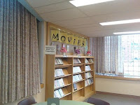
Eager to assist my patrons, young and old, from the minute they enter the building, I made this sign with them in mind. The letters are angled towards the entrance and on a clear day (that is, a day that isn't 40+ child deep...), the sign is obvious from the circulation desk. I made this sign by blowing up the font to as large as it would go for a single page, taped the lettered sheets to one side of a manilla folder and on the other side, I taped the fronts of recycled book jackets:
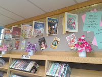
Want a closer look at the construction?
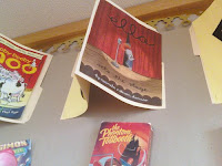
I rounded out this display by incorporating old, empty VHS cardboard sleeves. This is definitely a sign that sticks out!
Sorry for the image quality on these - I took the photos using my camera phone!
3 comments:
Your signs look great! I like how they are very big and very colorful. Thanks for including the photos.
A bow to the Queen of Signs...great job, Heather!
This is great and I've seen it in person.
Post a Comment