While looking up something at the CIA World Factbook today, I noticed that they have a kids' page. On that kids' page are some neat games, including one in which the player analyzes a photograph to produce useful information.
https://www.cia.gov/kids-page/games/aerial-analysis-challenge/index.html
Once you are done with that, there is the Photo Analysis Challenege, in which you compare the differences between two similar photos of the "same" stretch of a city street.
https://www.cia.gov/kids-page/games/photo-analysis-challenge/index.html
More Games: https://www.cia.gov/kids-page/games/index.html
- Jason Carter
NER
Monday, May 11, 2009
Saturday, May 9, 2009
Real Estate in the library
Hey Northwesters! Many of you know I'm prone to rearranging my collection and it shouldn't surprise you that yet again, I'm feeling the itch to move stuff - basically, as soon as my staff gets used to a current arrangement, I find myself planning a New and Improved arrangement.
One of the things I try to keep in mind when reconfiguring my collection is whether or not the change is truly new and improved. I ask myself if the new location will make sense not just to the staff but to the patrons. Next, I try to validate whether or not I've made the best use of the space available. For instance, for the longest time, I had my DVD/VHS collection situated near the back of the department. It was in plain sight from the door, but one would have to walk the entire length of the department to reach the much-desired collection. This positioning was purely marketing - I placed the collection in the far corner with the expectation that patrons would inevitably pick up other items (books! CDs! anything!). And, for awhile, it did seem as if this tactic was successful. But, in recent months, I noticed that my circulation statistics for this niche of my collection weren't improving despite the popularity of the items. I watched patrons come in to the branch, tractor-beamed to the far corner, blind to all of my other efforts to boost circulation (signs! displays! posters!), and I made the decision to abandon the tried and true supermarket technique (you know, milk in the back corner) because it turns out that this doesn't work as well in my library. So, I moved my DVD collection nearer to the center of everything and so far, so good. I don't have any firm data supporting the move as it's just been a month or so, but I'm pleased with the switch. This new location seems to be more in tune with what my patrons expect. Being able to recognize and act on that is somehow just as important as any other aspect of my job.
When it comes to fitting a collection to a space, there's the most obvious criteria: does that collection physically fit the space? I've had a number of good ideas that were nixed even before being put on paper simply because there would not have been enough room to do what I wanted. Other ideas are nixed because they inherently prevent the potential for collection growth (whether due to a lack of weeding or a surplus in the materials budget...). Nothing says "Don't check these books out!" quite like having to use a crowbar to pry the desired volume off of the shelf.
But there are also some less-obvious criteria for fitting a collection to a space: will it flow from one section to the next? Even if you have the space to put your audiobooks at the end of your reference collection, you shouldn't - there's no flow. Your biographies should go at the end of your reference (or some similar project-based collection, like science fair books). Your audiobooks should be placed as near to your other audio/visual materials as possible - this makes it easier for searching, easier for shelving, and easier for patrons. Is it inviting to the intended patron? I used to shelve my Family Favorites picturebooks (the ones that I found were most-requested: Eric Carle, Dr. Seuss, Curious George, and some others) on top of my picturebooks shelving. Now, the picturebook shelving is low - 3ft tall or so. But, for the intended patron - toddlers and pre-Ks - this was just not the most inviting (or safe, for that matter) arrangement. How could I expect these Family Favorites to circulate if Junior couldn't reach the books or, worse, tried to reach the books by climbing on the shelves (and falling, and getting hurt, and just overall being a no-good, very-bad situation)?
But why am I thinking about rearranging my collection again? I mean, aside from the DVD-shift, did I misunderstand my patrons and their needs? Or have things changed so greatly since the last time I did a major rearrange? Neither of those is the answer - instead, I'm looking at changing the layout of the department for very different reasons than I normally use. One, I'd like to have on-the-floor space for storytimes. With our meeting spaces being more frequently booked, I think it would be nice to be able to invite daycares and preschools to the branch without worrying too terribly much about whether or not the meeting space is available (that's not to say I would just start scheduling things whenever I wanted). The way the department is currently laid out, if I were to do a storytime on the floor (and I've done several), I'd be competing for attention with the front door, the front desk, the computer reservation station, the phone, and patrons and staff moving and milling about. I feel like it would be much better for all involved if I could tuck my picturebooks in the far corner, still within my line of sight but just a bit out of the main lane of library traffic.
The other reason I'd like to make this change is as a response to some behavioral issues among our after school patrons. Try as we might to maintain order, every day we face some level of chaso - whether it's from kids that have been penned up in the classroom all day and are just feeling rammy or it's from the 'tweens and teens who are testing authority, there are days and weeks when the staff goes home exhausted. If changing around my collection helps improve my statistics, I wonder what it would do for behavior issues? Would having the after-school crowd closer to the circulation desk and the guard's station mean a kinder, gentler after-school group? There's only one way to find out, I suppose, so let the to-scale drawings begin!
Question for you all: do you feel that you're making the best use of the space in your library? Do you feel like your collection makes sense or do you look at parts of it and say, "Then there's these books and I don't know what to do with them..."? If you had to brag about one feature of your department, what would it be and why? Any other comments or thoughts about making the most of the real estate in your department?
Wednesday, April 22, 2009
Activities for Eric Carle Books
Wandering the web looking for activities parents can share with their kids I came across
http://www.eric-carle.com/catexchange.html
The Caterpillar Exchange is where teachers post ideas based off of Eric Carle's books. Find your favorite Eric Carle title and click on it and then browse the activities. Most of the ideas look simple and fun.
I'm going to try one out the next time I have a kindergarten storytime!
Saturday, March 7, 2009
The Librarian's Guide to Gaming
An online toolkit for building gaming at your library.
This site was just posted (Mar 2, 2009)by ALA and includes tools and resources, best practices, and even a calendar of conferences and events relating to gaming: traditional, electronic, theory, and education.
And here is a pdf file with a few board games for a wide range of ages, mostly elementary.
Share a Story - Shape a Future - a literacy blog event from ALSC
(To see this article with enabled links got to the ALSC Facebook Page Note.)
During the week of March 9 - 13, please come visit Share a Story - Shape a Future. Each day, a different blog host will feature links to blog posts on a variety of topics having to do with children and literacy. Here is the schedule as of today, but please check the event blog for updated information, as the event is growing by the day.
Day 1 - March 9: Raising Readers
hosted by Terry Doherty at Scrub-a-Dub-Tub, the Reading Tub blog
* Finding Time at Home - Tricia Stohr-Hunt @ The Miss Rumphius Effect
* Making Time in the Classroom - Sarah Mulhern @ The Reading Zone
* Helping a Reader in Need (remedial readers) - Sandra Stiles guest post on Scrub-a-Dub-Tub
* It’s Bigger than the Book: Building Strong Readers at any Age with a Daily Dose of Read Aloud - Cathy Miller interview on the Share a Story - Shape a Future blog
* Keeping Gifted Readers Engaged - Donalyn Miller @ The Book Whisperer
Day 2 - March 10: Selecting Reading Material
hosted by Sarah Mulhern at The Reading Zone
* The ABCs of Reading: Infants, Toddlers & Preschoolers - Valerie Baartz on The Almost Librarian
* How to Help Emerging Readers - Anastasia Suen @5 Great Books NEW LOCATION!
* Helping Middle Grade Readers - Sarah Mulhern @ The Reading Zone
* Booklists and Read Alikes - Sarah Mulhern @ The Reading Zone
* Using Non-fiction - Mary Lee Hahn of A Year of Reading, hosted by the Stenhouse blog
Day 3 - March 11: Reading Aloud - It’s Fun, It’s Easy
hosted by Susan Stephenson at the Book Chook blog
* Ten Terrific Tips from Read-aloud Queen, Mem Fox - on the Book Chook blog
* Conquering Stage Fright - Interview with Sarah Mulhern/The Reading Zone @ the Book Chook
* Reading Aloud With Kids: A Dad’s Perspective - hosted by Steven and Brian at Book Dads: Fathers that Read
* Using Technology for Read Alouds - Sarah Mulhern @ The Reading Zone
* What to Do When the Reading is Done - Aimee Buckner, hosted by the Stenhouse blog
* Reading Aloud with Independent Readers - Donalyn Miller @ The Book Whisperer
Day 4 - March 12: A Visit to the Library
hosted by Eva Mitnick at Eva’s Book Addiction blog
* From Cozy to Cool - Library Spaces for Everyone - Eva @ Eva’s Book Addiction
* Lions and Marble and Books, Oh My - Betsy Bird at A Fuse #8 Production
* How to Make the Library Work for YOU - an interview with Adrienne of What Adrienne Thinks About That conducted by Jules at Seven Impossible Things Before Breakfast
* The World Beyond the Library’s Walls - Melissa @ Librarian by Day
Day 5 - March 13: Technology and Reading - What the Future Holds
is hosted by Elizabeth O. Dulemba at Dulemba.com
* Audiobooks with Bruce Coville of Full Cast Audio and Mary Burkey of Audiobooker
* E-books with Harold Underdown of The Purple Crayon and Sheila Ruth of Wands and Worlds
* Podcasts with Andrea Ross of Just One More Book! and Cheryl Rainfield of cherylrainfield.com
* A resource of links to audiobooks, e-books, podcasts and webcasts @ Dulemba.com.
There will be plenty of giveaways, contests, and links to cool stuff, and most of all - inspiring and insightful posts by children’s literature bloggers. Guests will be invited to share their own knowledge and love of reading as well. Please tell parents and teachers and fellow children’s librarians about this blog event. See you then!
Tuesday, February 3, 2009
Newbery display.


Wanted to share my Newbery display with you all!
The cards in the top of each book indicate the year it won the Newbery. I'm thinking about pulling them out, though, because people keep asking me if it's okay to check out the books on the display. My Caldecott display is circulating much better (I've replenished it several times a day since I put it up the day the awards were announced) without the year cards. Sometimes fancier isn't better!
Monday, January 12, 2009
Mock Caldecott Program for Class Visits
Has anyone ever done a Mock Caldecott program before? I think it sounds like a lot of fun and something that would be memorable for the kids. I'm thinking of doing the program with first and second graders...kindergarten might be too young.
Here is how my current program outline:
1. Gather about 16-20 books. There are a lot of lists of possible contenders published by other libraries and there is even a spreadsheet created by Jim Averbeck showing which books appear most often on those lists.
2. Print out slips of paper with numbers 1-3. Each number has its own color. For example, 1 is on blue paper, 2 on red, 3 on green, etc.
3. When the class comes, I will explain what the Caldecott award is, show an example, and lead a discussion about the illustrations in picture books.
4. I'll divide the class into 4 or 5 groups and handout the numbered slips to everybody.
5. Each group will examine 4 books at a time.
6. After everyone gets a chance to look at the books, the kids get to vote by raising their slips of paper. Each book will have a number, and one child in each group will be the recorder to record how many votes each book received. (I think I'll create a spreadsheet for the recorder to make it easier.)
7. After everyone votes, I'll rotate the books on to the next group. This will continue until everyone has seen every book or until time runs out.
8. When the class returns, I will read the top 3 books and the kids will vote again to select their Mock Caldecott winner. I'll also announce the national Caldecott winner. This year, the national winner will be announced Monday January 26.
Is this type of a program possible with first and second graders?? Any suggestions?
Result: With a first grade class this was very chaotic. I think for first grade next time I will modify the program--I'll handout the voting slips, read 3 stories, and then have the kids vote and discuss. Perhaps this program is better geared towards grade 3-4. The kids were capable in small groups, but having 5 groups of first graders was just too much.
Friday, January 2, 2009
A Close Friend's Debut Children's Novel
The Truth About Horses, Friends, and My Life as a Coward. Sarah P Gibson. Ill. by Glin Dibley. Marshall Cavendish Children: Tarrytown, NY. 2008. 146 pp.
Mixing the droll, deadpan understatements of the traditional Maine storyteller and the tongue-in-cheek humor of a Sciezska or a Pinkwater, Sarah P. Gibson offers 16 delightful vignettes of native, Maine Islander Sophie Groves’ struggle deciphering what’s easier: living with three crafty, ornery, downright nasty horses or discovering true friendship among her classmates. Her seemingly doomed attempts to win the respect of her family’s three horses, while at the same time navigating the social world of the pre-teen, looking for a friend who is a true friend and not just a (shudder) “horse lover,” provides a unique and funny look at growing up in Maine.
Each chapter is an unexpected and humorous tale of trials and tribulations showing the horses who’s in charge and trying to convince new found friends that horses are not the adorable, noble steeds they are thought to be. Sophie Groves’ understated, dead-on, Laocoön-like predictions of the horses’ behavior along with her friends shocked surprise upon experiencing the true nature of horses, never fails to provoke a laugh. Gibson allows the reader to experience the sweet sensation of knowing better than the characters that enter into Sophie’s life.
Will anyone ever listen to Sophie when it comes to Sweetheart, Fancy Free, and Really? Are sweets the only means of convincing the horses to cooperate? Can she cope with the Carpwells? How easy is it to tell a moose from a horse on Halloween Night? Is there a true friend for Sophie? Find out the truth behind all these questions in Gibson’s The Truth About Horses, Friends, and My Life as a Coward.
Friday, December 26, 2008
Character Counts Booklist
Need to find books that teach specific character traits?
You can find a list at http://charactercounts.org/resources/booklist.php
The booklist includes books ranging from the Grouchy Ladybug to Jacob Have I Loved. It includes author, title, number of pages, type of book, and which trait the book illustrates. Some of the books seem a little outdated, but some books are still in demand and in the FLP system.
The 6 character traits are: trustworthiness, respect, responsibility, fairness, caring, and citizenship.
Monday, December 8, 2008
Signage
It's no secret that I LOVE making signs - the bigger and more elaborate, the better. I typically have 4 or so sign making binges a year. There are just times when I need to make signs!
Here's what I've been up to lately.
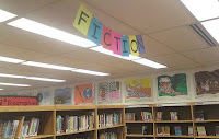
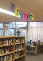
A simple sign made using Comic Sans font, colored paper, and twine. I used MS Publisher and set my paper to landscape format and then made the font as big as I could while still printing two letters a page. I needed the sign to be double-sided since it can be seen from both the book stacks and the circulation desk, but I also needed a sign that didn't require lots of taping, cutting, or lining up. So, I calculated the letters and then laid out each page with two letters like this: F N,I O, C I, T T, I C, O I, N F. After printing out the letters, I folded each sheet in half, used a little bit of tape to hold the fold together, reinforced the top edge of each (now) double-sided letter section using some book tape, punched a couple of holes in the top of each sheet, and then ran some twine through those holes.

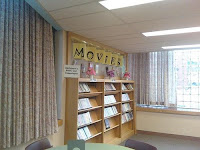
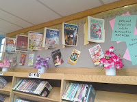
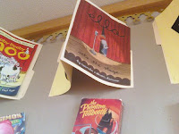
Sorry for the image quality on these - I took the photos using my camera phone!
Here's what I've been up to lately.
A simple sign made using Comic Sans font, colored paper, and twine. I used MS Publisher and set my paper to landscape format and then made the font as big as I could while still printing two letters a page. I needed the sign to be double-sided since it can be seen from both the book stacks and the circulation desk, but I also needed a sign that didn't require lots of taping, cutting, or lining up. So, I calculated the letters and then laid out each page with two letters like this: F N,I O, C I, T T, I C, O I, N F. After printing out the letters, I folded each sheet in half, used a little bit of tape to hold the fold together, reinforced the top edge of each (now) double-sided letter section using some book tape, punched a couple of holes in the top of each sheet, and then ran some twine through those holes.
I recently made a big shift with my non-fiction, including special collections like Biographies and Holidays. Among those niche collections relocated was my group of atlases. I've wanted to give the atlases a space of their own for while, if only because I had a great idea for a sign in mind. Once I had the books in place, all I needed was a few supplies: bright poster board, thick letters, and some ClipArt make up this sign:

I used Publisher (again) to make an oversized circle (I opted for a custom-sized poster as my layout blank). Then, I looked for the most elementary image of a globe using ClipArt. I wanted something abstract since I wasn't aiming for perfection nor was I intent on cutting out intricate shorelines or islands. Using MS Word, I was able to ungroup the ClipArt image and use just those portions that I wanted. Then, I upsized those little odd looking and non-geographical entities so that they would be semi-proportionate to my blue circle. I printed everything out, cut out the shapes and taped it all together. I think that aspect of sign making really appeals to the puzzle-lover in me - I get to piece it just so. I made the letters using over-sized black font and then cut them out using an Exacto. The whole sign took about an hour to make, start to finish, and it's my current favorite.
My old favorite sign is still going strong at the library:

Eager to assist my patrons, young and old, from the minute they enter the building, I made this sign with them in mind. The letters are angled towards the entrance and on a clear day (that is, a day that isn't 40+ child deep...), the sign is obvious from the circulation desk. I made this sign by blowing up the font to as large as it would go for a single page, taped the lettered sheets to one side of a manilla folder and on the other side, I taped the fronts of recycled book jackets:

Want a closer look at the construction?

I rounded out this display by incorporating old, empty VHS cardboard sleeves. This is definitely a sign that sticks out!
Sorry for the image quality on these - I took the photos using my camera phone!
Subscribe to:
Comments (Atom)